engaging employees on a gamified academy
the need to continuously train employees in multiple skills prompted an industrial automation company to ask us to develop a dedicated e-learning platform.
to answer this need, I mapped the educational journey and designed a responsive platform that engages more than 800 people in 10 different countries.
about the project
company:
industrial automation company
timing:
6 months (1st wave) | 2020 → ongoing
role:
UX/UI designer, consultant
design team:
myself, Senior Manager, Web Specialist, Content Editor, agency (Art Direction)
journey mapping
information architecture
wireframing
prototyping
usability testing
some information in this case study are omitted or changed to preserve the confidentiality of the project
contents
challenges in corporate online learning
How to promote soft skills within an industrial automation company, whose culture is traditionally technical and engineering-focused?
How to spark interest in topics not covered by mandatory training among employees?
How to reach everyone through digital, from offices to factories, especially during the Covid19 pandemic?
These were the questions we faced when Methodos was tasked by the HR department of a multinational company to design and develop an e-learning platform for continuous training on soft skills.
new demands during the Covid19 period
The first thing our team did was to collect the needs of clients, stakeholders, and users.
The main need of our clients was to transfer to a digital platform their in-person content and training programs on soft skills during the pandemic.
The change to the digital domain gave the opportunity to reorganise the programmes, but also the risk of reduced online engagement, underlining the importance of creating an engaging and satisfying experience for users.
As the only designer in the team, I had had no chance to collect information directly from the users, we only had access to data previously collected by our client on employees' content consumption habits and preferences.
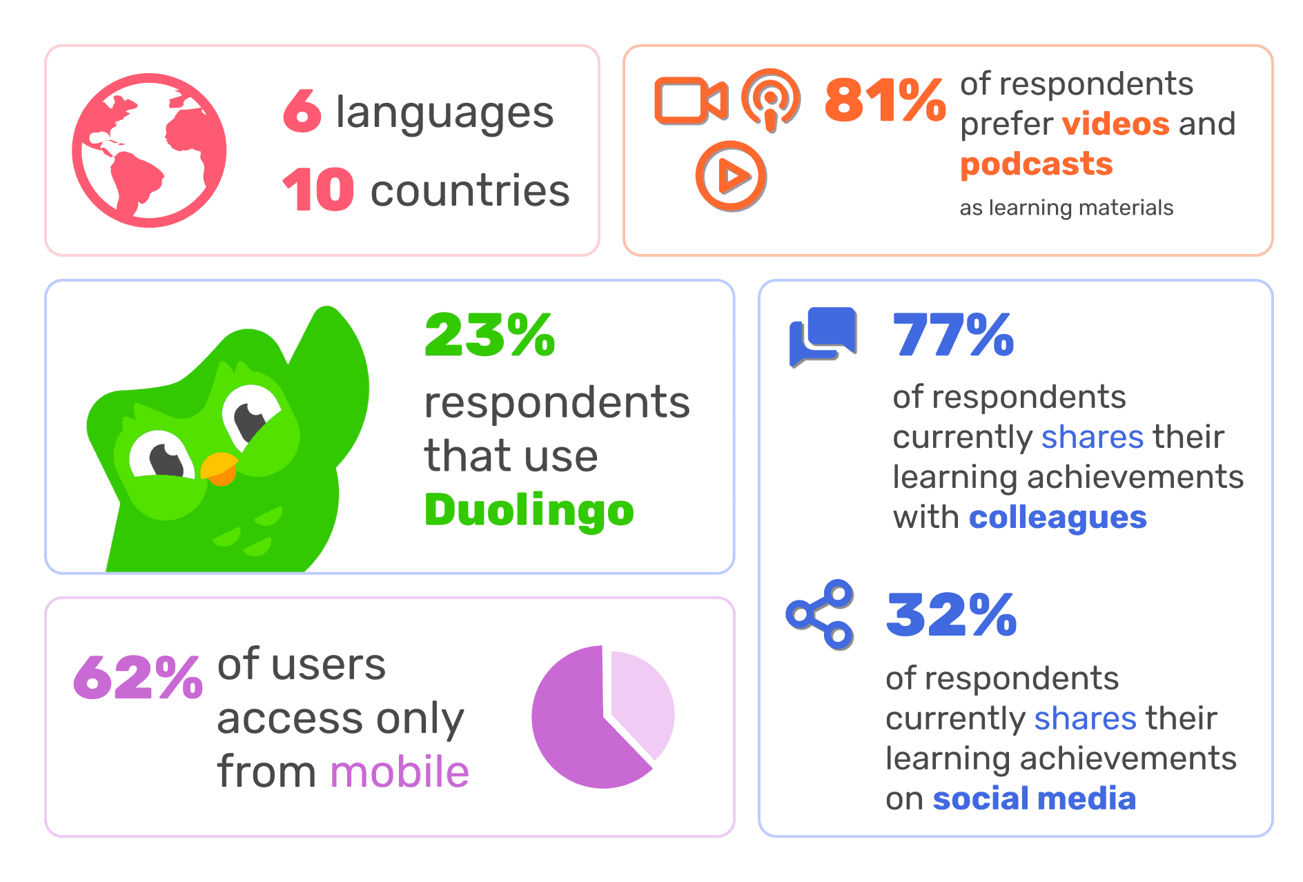
However, we found some interesting data, such as that the preferred mode of consumption was through videos or podcasts, and that one of the most cited and used app was Duolingo.
Some data collected from users
Remote card sorting session to define how to categorize learning items
how to keep the interest in learning alive?
Once we had identified the main needs, my main objective became clear: to design a digital platform that would guarantee the most fluid and stimulating leraning experience we could achieve.
For this, we took advantage of the fundamental principles of gamification and psychology applied to UX design.
For example, we gave different meaning to various activities using Challenges and Rewards, we focused on providing the learning content with engaging media such as videos and podcasts, and leveraged principles such as scarcity or the Zeigarnik effect to stimulate activity on the platform.
In particular, using research data I defined the user journey and user flows, defining the main touchpoints in a way that was effective for the customer and satisfying for the user.
starting lean: design and development iterations
We envisioned the platform in an MVP logic, so the next step was to design the platform for the first release: at go-live, the platform functions were designed to introduce users to the new digital environment, make them familiar with the new training and gamification logic, and make them comfortable with some training content.
As the only UX/UI designer in the work team, I took care of translating the flows into pages and screens, consistent with the gamification principles identified.
The visual design was also subject of particular attention from the client: in fact, they asked an external Art Director to realize the graphic identity of the platform in its main elements (logo, color palette, illustrations, badge design, ...).
My role was to discuss with the Art Director to design a UI that was consistent with this vision and harmonize the visual identity in the platform.
Sitemap of the first deployment - focus on learning materials (Programs and Library) and early developments in gamification
Information Architecture of the platform, including relations with other apps, such as the integrated Performance Development app (not covered by this project) - may 2023
takeways
The main challenge of this project was to support the client in defining how to answer to an uncertain period. As the situation and needs changed, often decisions made previously were questioned, and it was not easy to remain focused.
On some occasions, we failed to remind the client of the reasons for certain choices or functions designed: for example, a sharing space with social functions was supposed to guarantee the principle of gamification of freedom, but the lack of care in maintaining and moderating this space led to its abandonment.
I learned that in long-term projects, where conditions and needs can vary greatly, it is important to set and often share common goals from the start, and often remember the team where we want to go.
However, surveys and periodic feedback from users, as well as usage data, have rewarded our work showing how dedication and attention to details pays off.


